If you’re an Amazon seller, you already know how tough it is to stand out. The competition is fierce, and buyers make split-second decisions based on what they see. For one of our clients, a simple design change boosted conversions by 30% in just weeks. Here’s how we did it.
Amazon A+ Content isn’t just about pretty visuals—it’s about guiding the buyer’s eyes, answering their doubts, and creating trust within seconds. We transformed the product page by designing modules that were clean, persuasive, and conversion-driven.
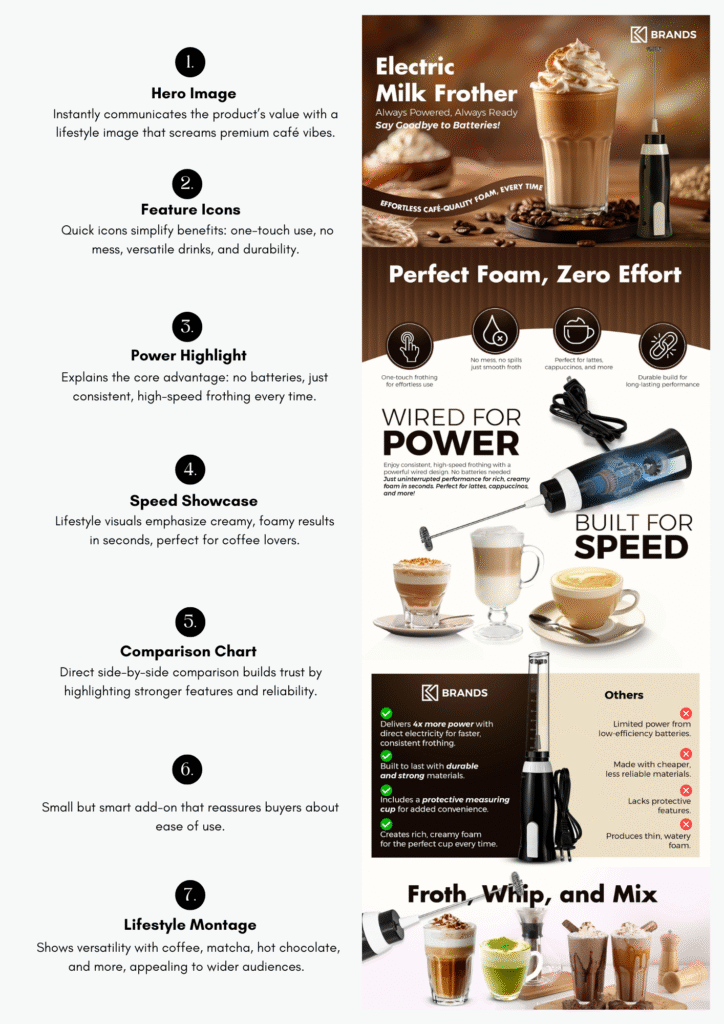
What Changed in the Design
Here are the key updates we made:
The Result: 30% Higher Conversion
Shoppers don’t want to think—they want clarity. Our design made the product’s strengths impossible to miss, which meant fewer drop-offs and more clicks on “Buy Now.”
If your listing isn’t converting, it’s not always your product—it’s how you present it. And that’s exactly where we come in.
📩 Let’s talk. We design A+ Content that sells.